Case Study
Why Haus of Gloi?
Let’s start with what the heck is this. Haus of Gloi is a small perfume brand that I happen to be fond of. The products are solid and well prices. The range of products is diversified and high quality. What is lacking is the design direction. Their original design is a dark and moody forest theme. This design is similar to many other indy brands that rely on heavy blacks and generic photos to describe their scents, meaning they don’t stand out. Haus of Gloi also maintains a wide variety of holiday themed products. The detriment of maintaining one strict theme is the limitations for product compatibility. A a brown bottle and black tree silhouette will not fit with Valentine’s hearts or Santa Claus. This limits the usability of the overall design for marketing to consumers.
On Inspiration: I’m a fan of historical design. Get me a scifi classic book and I’ll drool over the cover. I was hugely inspired by Kitsch for creating this redesign. The obnoxious colors with 1950 and the subtle tonality of the figures is perfect for a stand out package and marketing campaign. Retro is in fashion: nostalgia, king. This concept allows me to lean into my high quality drawing and tonal qualities in my art. Kitsch also allows for analysis of type with its boldness. Yes, Kitsch is defined as low brow and bad design but that’s what allows for exploration. In an oversaturated market, in this case perfume but also beauty in general, it is worth taking a design risk.

About the Design:
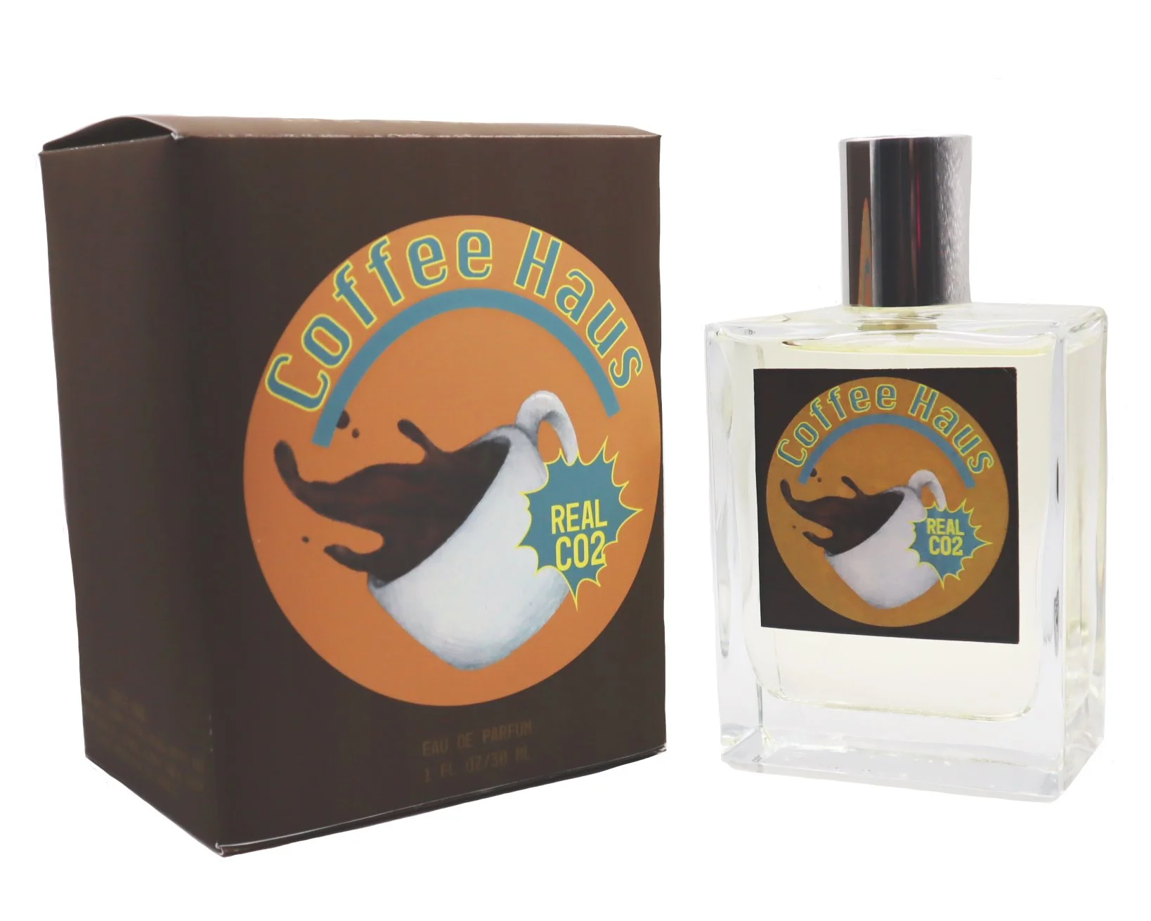
To incorporate design principles, I used repetition on the box to add interest to areas that would otherwise not have much visual interest. I also had used transparency to lead the eye to some areas of the box and diminish others for them to be viewable after the main information was viewed. This use of transparency also helps with the visual balance of the design by allowing some visual information to be impactful but not cluttered. Hierarchy is achieved through use of color. I had a limited color pallet that draws attention but not over stimulate the viewer. Contrast is the main aspect used for my design. Kitch uses bright and bold colors but the product I’m depicting also included a dark, rich coffee that would not benefit from bright colors. This use of contrast between the yellow toned background and the bold brown of the background allows the viewers attention to be pulled while also showing the perfume as it will be smelt. I also incorporated framing into my design by isolating my bright colors within a circle. A tiny bit of depth is used by adding a drop shadow to my framing.


Creative Process:
I start with my love of perfume, naturalism, and color. The fun part of a portfolio is self direction and giving it your all. Once I identified who I would pretend to be working for and the reasons why I identified the scope of the project. To give it my all I decided to do a whole brand identity around my main Kitsch design theme. I would need a logo, box design, bottle design, multi products, shipping, and social media concepts. Ambitious but it does highlight what an in-house designer would be working on.
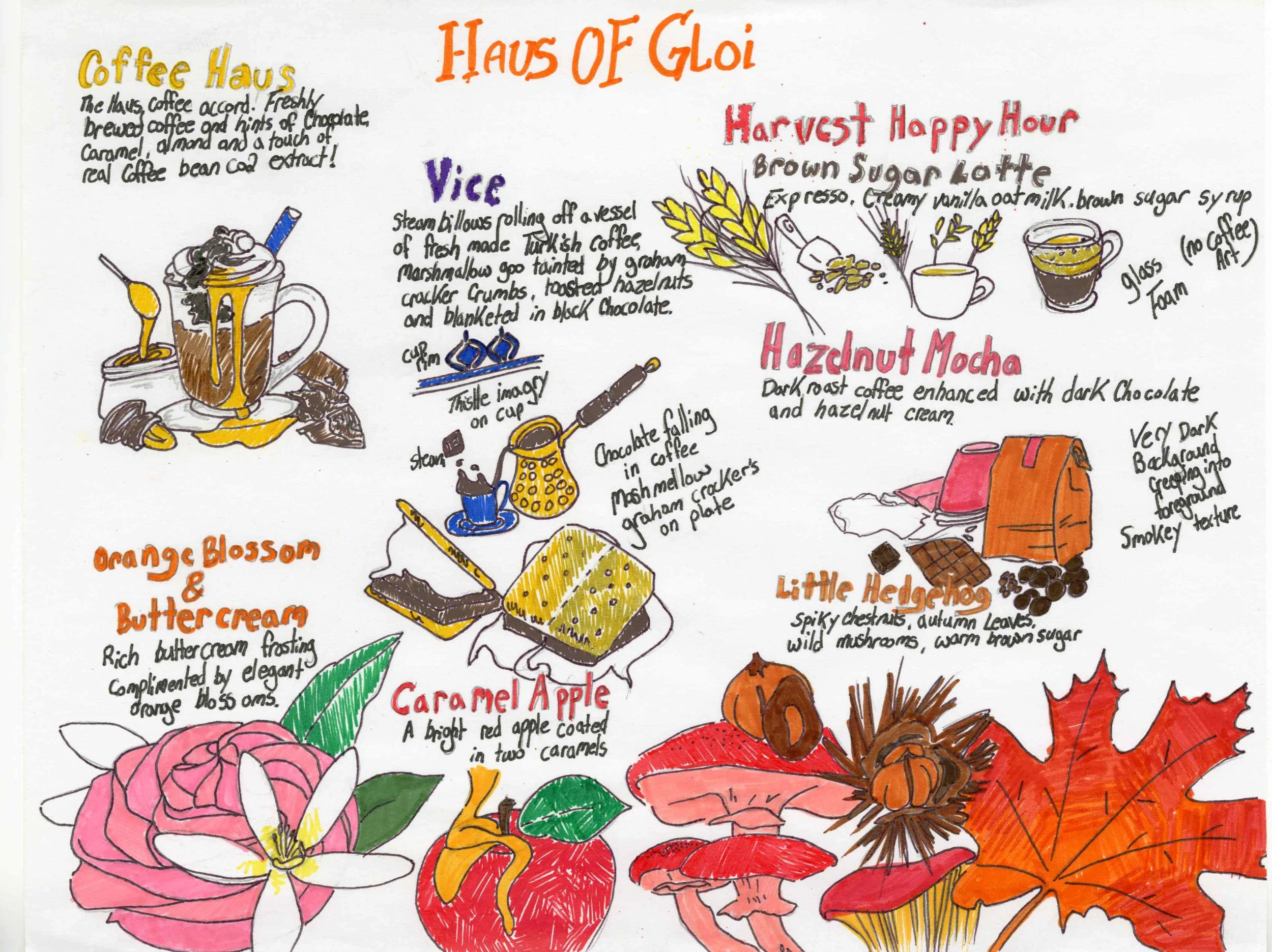
I want to use my style to represent their product. I carefully considered their product descriptions on a handful of scents that interest me and created thumbnails using the descriptions. I created drawings of the possible imagery to be used along side the descriptions. After the thumbnails creating I requested feedback from other artists and proceeded with the design deliverables.
My first design for this brand is based on their general catalog Vice scent. With my incorporation of 1950’s kitsch into the design I chose to use both traditional and computer based media. For my illustration I used traditional pencil and inks and for my type, shapes, and background I felt illustrator was best. I used photoshop to smooth out my illustration at the edges creating a neater transition between the traditional illustration and computer elements. I used a sc 7000 printer to create my final product as well as label printing through Office Depot and a laser printer available to students.
I started with a split complement of cyan (blue), yellow orange, and red orange. The red orange proved problematic in application and hindered readability leading me to switch to yellow, yellow orange, and cyan (blue). Even though it is not a true split complement I feel that it was beneficial to tweak the concept. My neutral brown tones down the garish bright of the other colors resulting in a more pleasant composition.
Everything has a starting point.
Mine was knowing which items from Haus of Gloi I wanted to start with. I took a look through my pile of sample bottles and looked up how the company describes each one. I accompanied the description with doodles of the major image descriptions that fit. This started the process of making the intangible [a scent] into a concrete image.
